better Power BI Visuals,
better Decisions

We are Nova Silva
Nova Silva, meaning ‘new forest’ in Latin, is a Dutch company and was founded in 2007. The founders came from various roles in management and IT at organizations such as Kappa Packaging, Temtec, IBM, Accenture and Rabobank.
We love to help organizations and their people to get more out of data.
This keeps us learning and become a little better every day. We are constantly looking for the balance between man and machine, automating repetitive tasks and processes and enabling people to be creative and meaningful.
In 2018 we decided to combine our extensive experience in Data Processing and Visualization with Microsoft Power BI. Together with our customers we were missing a number of important visuals. This resulted in developing visuals for Power BI.
Obviously, we can’t do this alone. Besides the valuable feedback from our customers we also work closely together with Microsoft. Therefore we are Gold Microsoft Partner. Read more about us.

Our Power BI Visuals
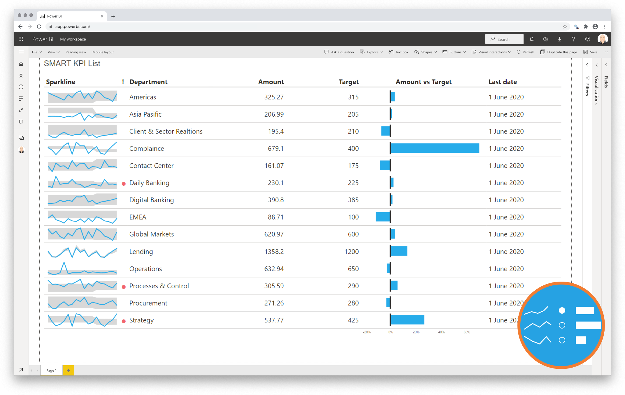
SMART KPI List
Display your key indicators in one view with the SMART KPI List
One of the principal goals of any dashboard is to inform its users by creating an overview of multiple key performance indicators (KPIs). A good dashboard shows all relevant KPIs in a single screen, so we need a compact and effective way to display them. The SMART KPI List is created specifically for this purpose. This visual allows you to manage your KPI’s: Specific, Measurable, Achievable, Relevant & Time-bound. more…
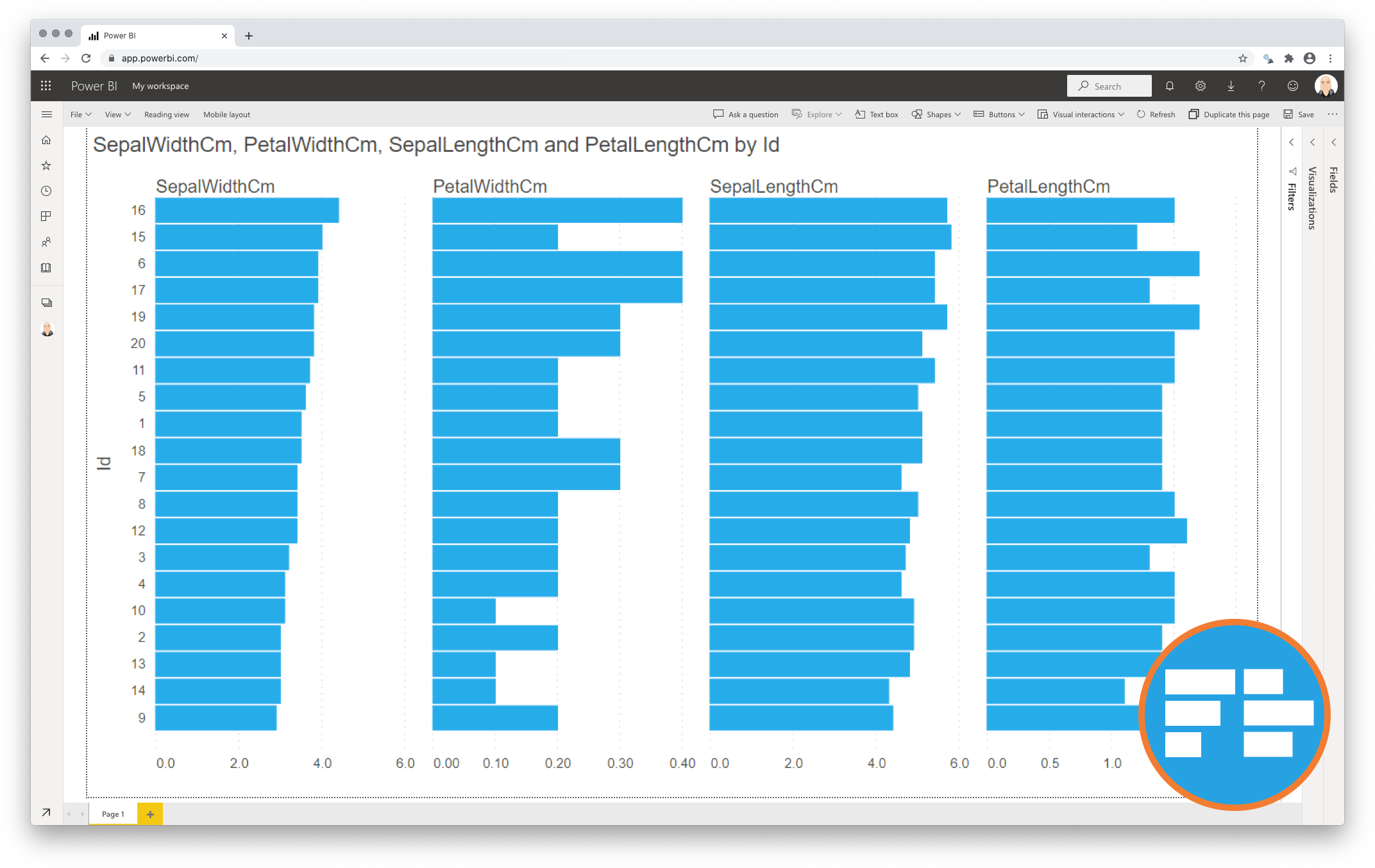
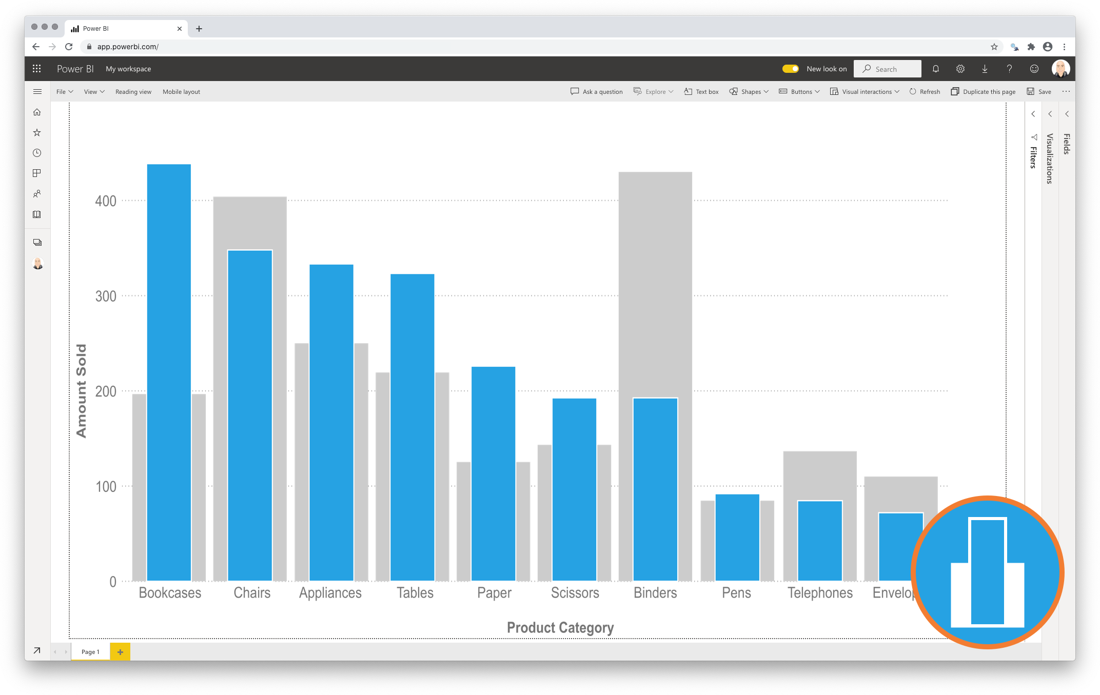
Merged Bar Chart
Discover the patterns across multiple measures with the Merged Bar Chart
The Merged Bar Chart allows you to compare multiple categories in a single chart, as an alternative to the more complex scatterplot. However, many people find scatterplots hard to read. And it is difficult to expand the number of measures beyond 3 or 4. This is why we created the Merged Bar Chart. This chart can show up to 6 independent measures per category in a comprehensible way. It does this by displaying each measure in it’s own bar-column and allows you to sort on any of the columns to investigate any possible relations between the measures. more…
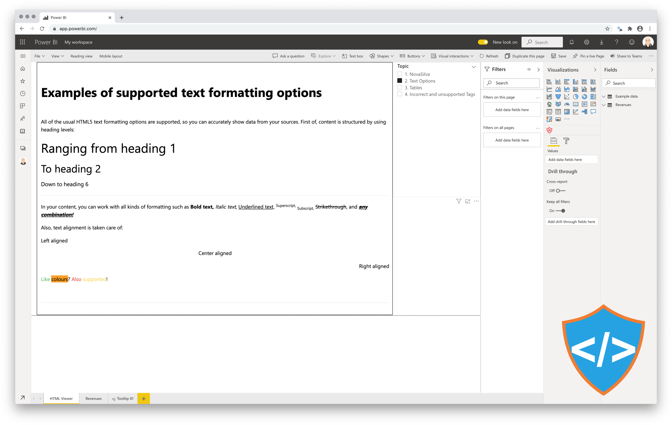
Shielded HTML Viewer
Visualize your HTML formatted content to add valuable context to your figures.
Most business applications allow users to enrich the data by adding additional context. Often, this additional context (like comments and feedback) is stored as HTML formatted text.
Being able to show this additional context adds value to reports and dashboard, as it helps the readers to better understand the presented figures.
The Shielded HTML Viewer will seamlessly display any HTML-5 formatted text next to other figures in your Power BI reports. more…
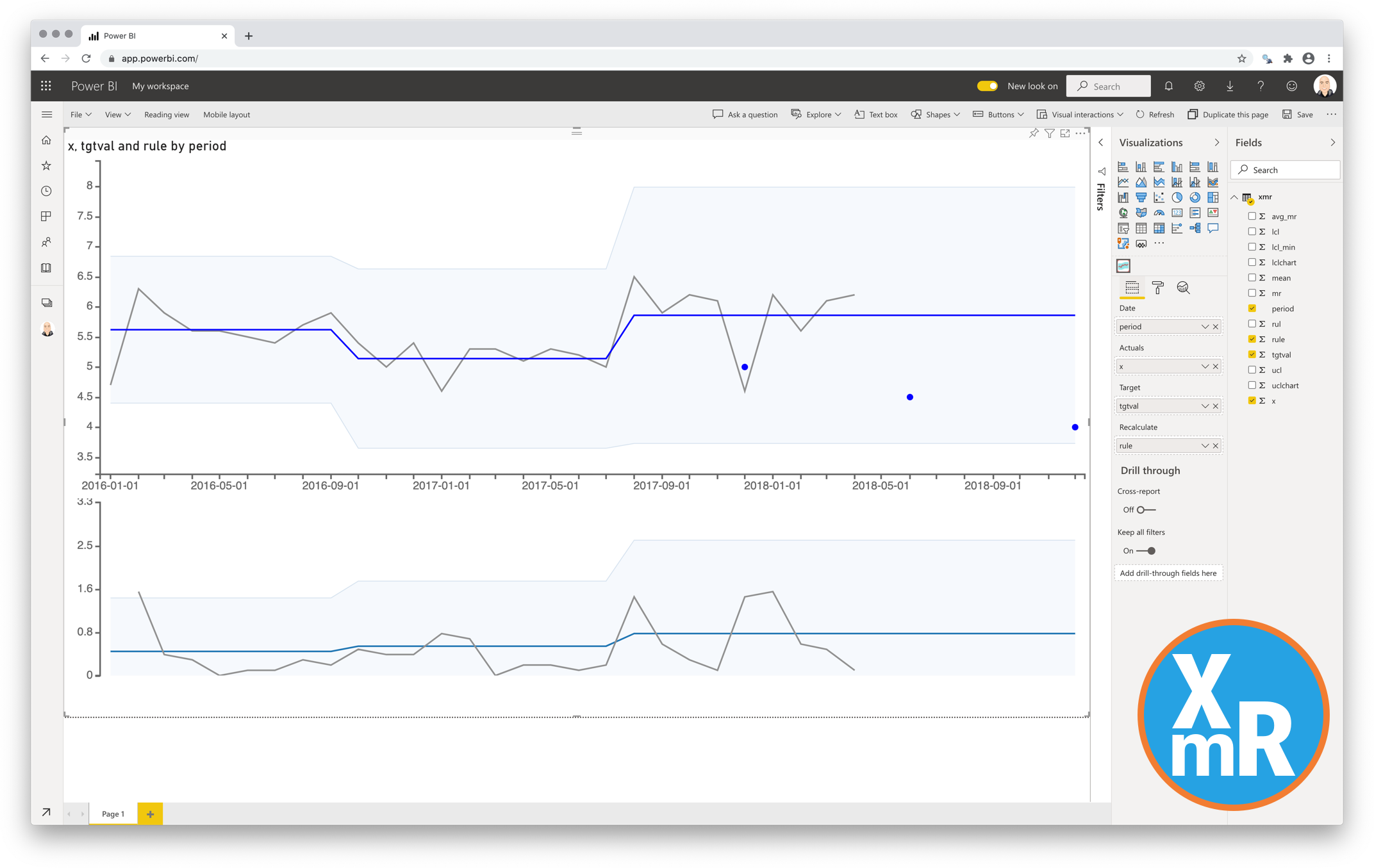
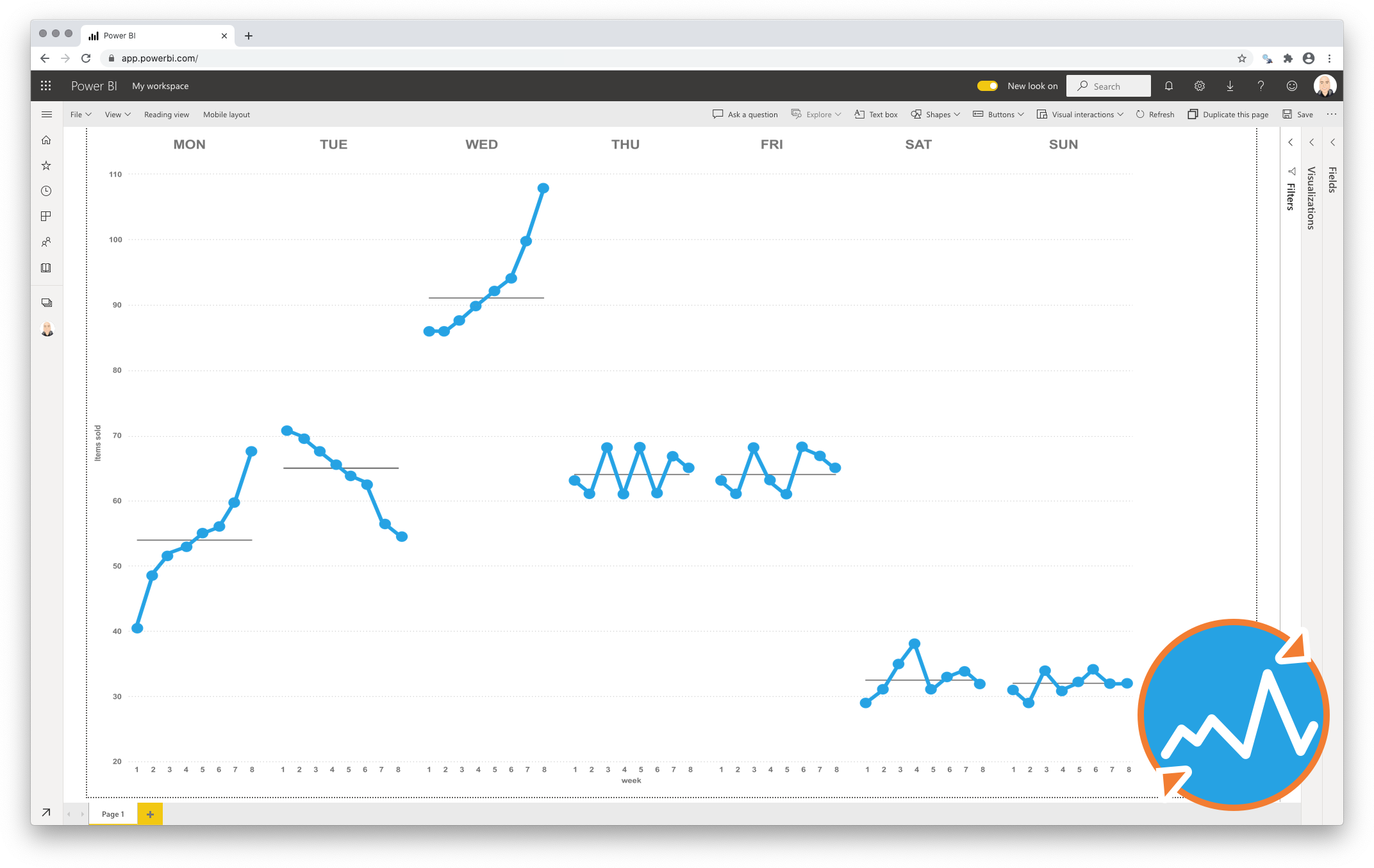
Control Chart XmR
The most useful way to see true signals of change in your KPI is to use a Control Chart (XmR chart)
By default all data is noise, but sometimes it contains a real signal. To detect the signals and ignore the noise you can use Control Charts. Without need to know all the statistical details this visual will allow you to see the real signals in your time-series data. more…
Lipstick Chart
Compact and precise visual comparison of two measures with a Lipstick Chart
This chart shows the primary measure per category on the foreground, and places the secondary measure behind it for a precise comparison of both values. Since both values are placed on top of each other it becomes a more compact alternative to show both measures per category. more…
Cycle Plot
Discover your seasonal patterns with the Cycle Plot
Time series data are great to clarify the changes over time in measures, and the line chart is the favourite chart for this type of data. But displaying results with a normal line chart can also obscure important patterns, especially if the measure contains some form of seasonality. The cycle plot (first introduced by Cleveland, Dunn, and Terpenning in 1978) is a type of line chart specifically developed to show seasonal time series. more…
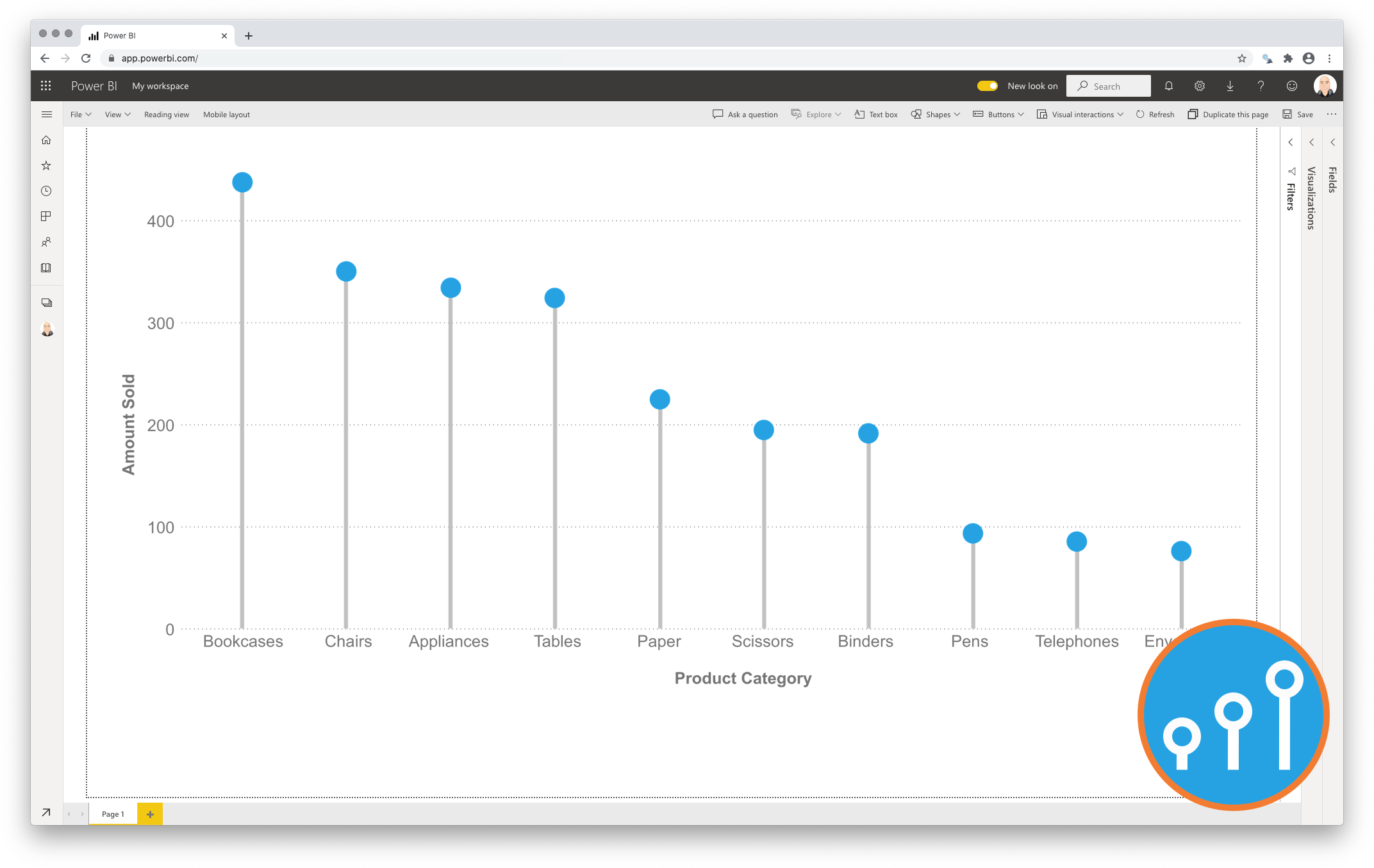
Lollipop Chart
Declutter your comparisons with a Lollipop Chart
To reduce clutter one can use the Lollipop Chart as an alternative to the standard Column chart. It shows an icon (mostly a dot) per category at the corresponding measure value for each category. The icon is connected to the measure-axis origin by a subtle line. The icon combined with the line make it a Lollipop Chart. more…
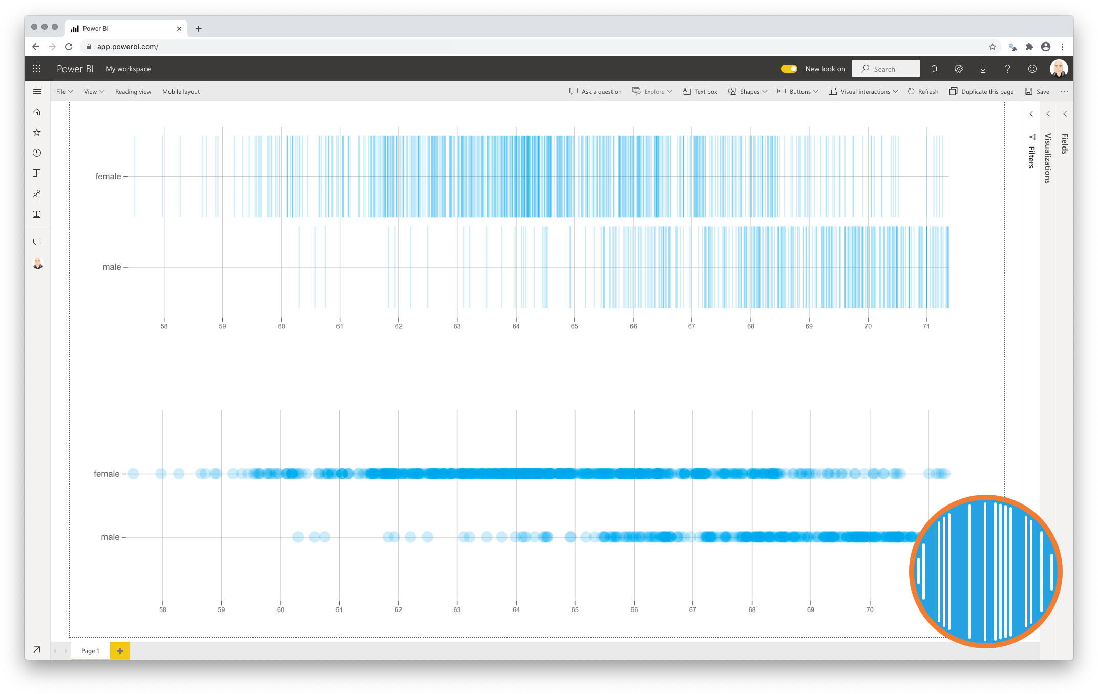
Strip Plot
Get to know your data without hiding critical details
Most charts used to display a distribution (like Histogram and box-and-whisker-plot) require you to aggregate the data (e.g. bins). This can potentially hide important patterns in your data.
The Strip Plot is a chart type that addresses these challenges by not aggregating any of the data points, but by simply showing each point individually. This will not only show you where the (concentration of) observations are, but also where gaps are between subsequent observations. more…
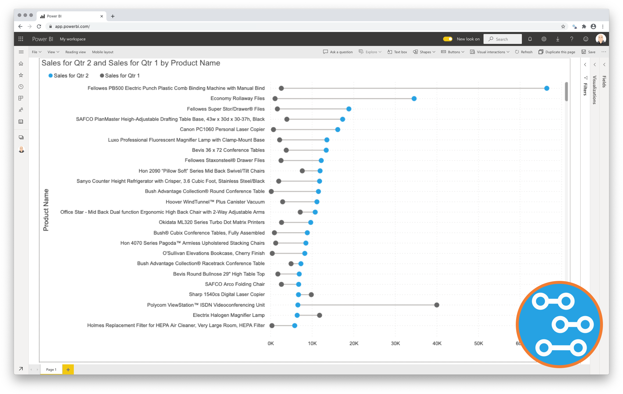
Dumbbell Chart
Unleash the power of comparison with the Dumbbell Bar Chart
A common question to address with data visualisations is: “Compared to what?”
Key in answering this kind of question is explicitly visualising the difference between the two results. This is the strength of the Dumbbell Chart: showing both the values and the difference between them.more…
Customers who trust us